Summary
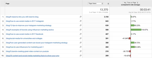
One of the powerful, easy-to-use features of Google Analytics includes the ability to compare the 'Page Views' and the 'Average time on page' allowing you to compare the performance of each page to the rest of the content on your site. Here’s an example from our blog:

Reading the image is simple: the more you see green on the right, the better the performance compared to other pages published on the site. Even though the post on the first row has been by far the most successful with a high number of page views (left column), readers seem to spend a lot more time with four other posts from the top ten of our blog posts. And to be quite frank, you’ll also notice that some of our posts have not been that engaging...
For a marketing professional, this information is gold; you’ll understand better what type of posts have performed well (and which have not), and over time you might be able to recognize patterns of what makes a successful post. This data also helps you to prioritize the content to be promoted in various channels (e.g., paid social advertising), and should eventually increase the conversion rates as you are sharing the content with higher engagement and dwell time.
How to find this information in Google Analytics?
Here’s a step by step guide:
- Login to Google Analytics and click ‘Behaviour’ on the left.
- Select ‘All pages’.
- Optional: Use ‘Advanced filters’ to view only the content from your blog or another key section of the website.
- Click ‘Comparison’ icon on the right (4th icon from the left).
- Select ‘Page Views’ to the first column and ‘Average time on page’ to the second column.
- Done, now it’s time to analyze and make the most of the posts with higher engagement!


